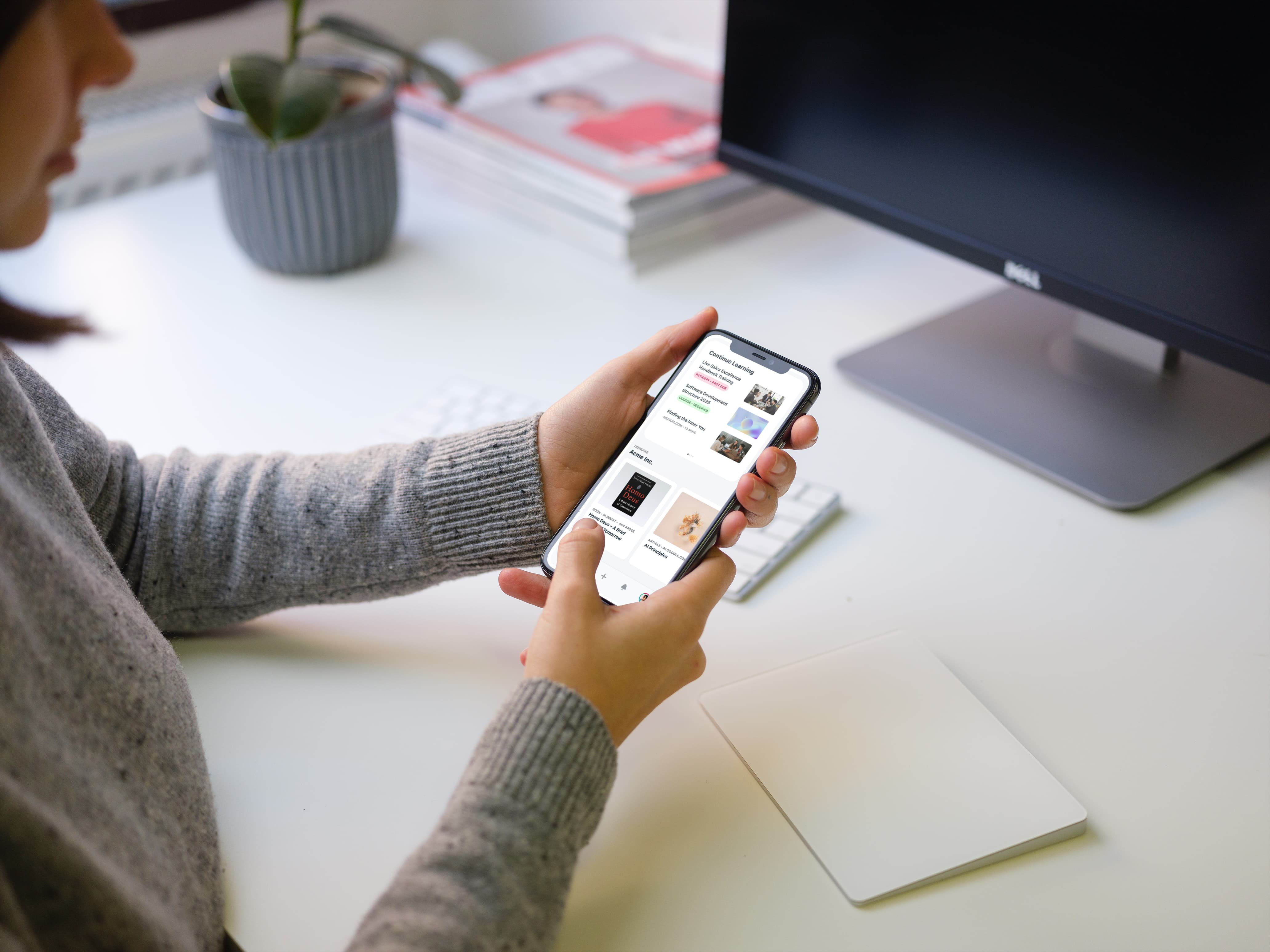
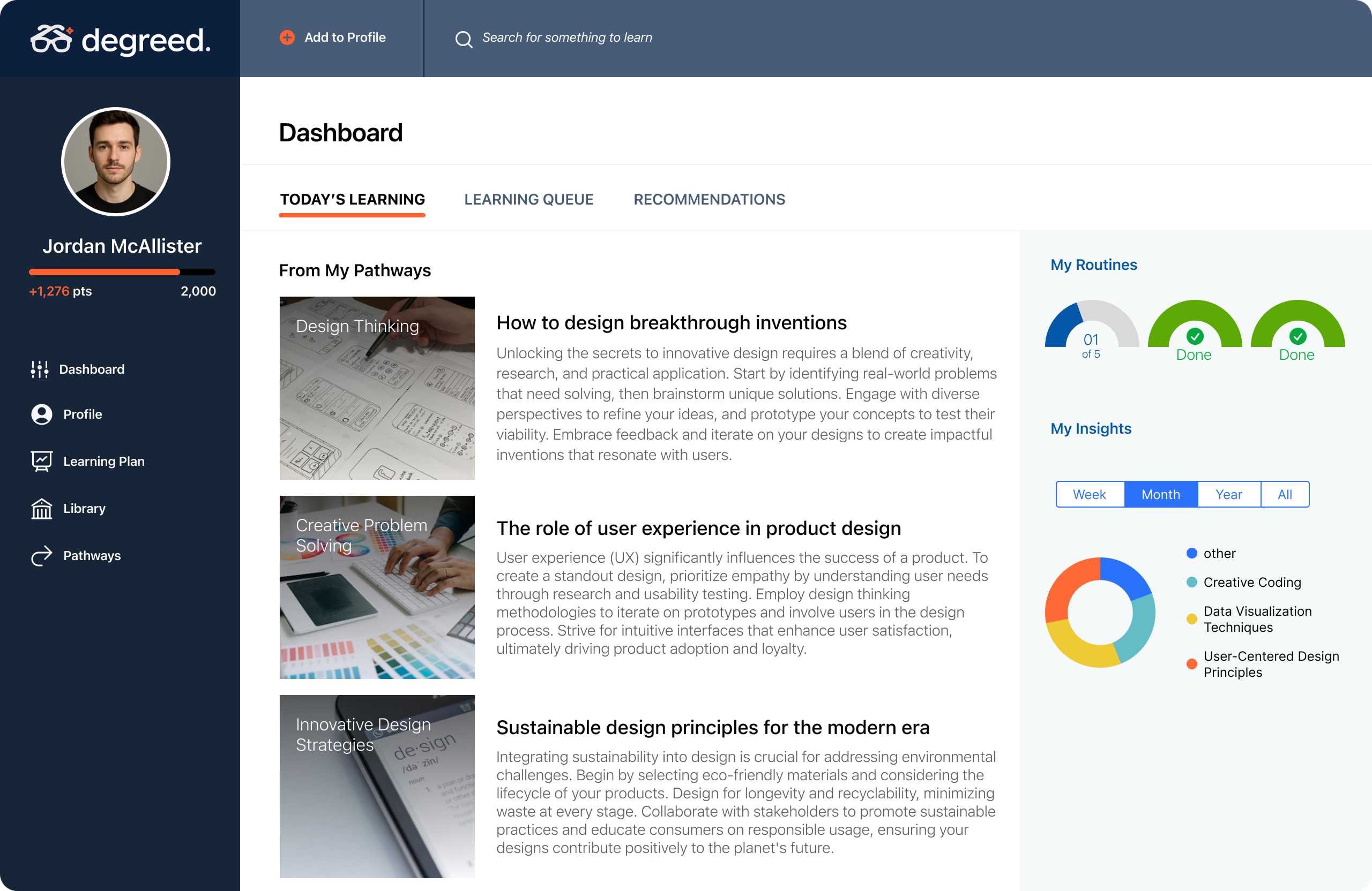
A companion app designed for quick, daily learning that grew to serve 70% of Degreed’s customers.
Role
Lead designer
Timeline
Four months
Team
One to two developers
Platform
iOS and Android
Context & role
When I joined Degreed, the product existed only as a desktop portal. I was hired to design the mobile app from the ground up and later led multiple iterations as the product matured.
The challenge: bring Degreed to mobile without duplicating the complexity of the web app.
The problem
The desktop portal worked well at a desk, but learners wanted to engage in shorter, more frequent moments throughout the day. Degreed needed a mobile experience that made learning lightweight, simple, and always accessible.
Early exploration
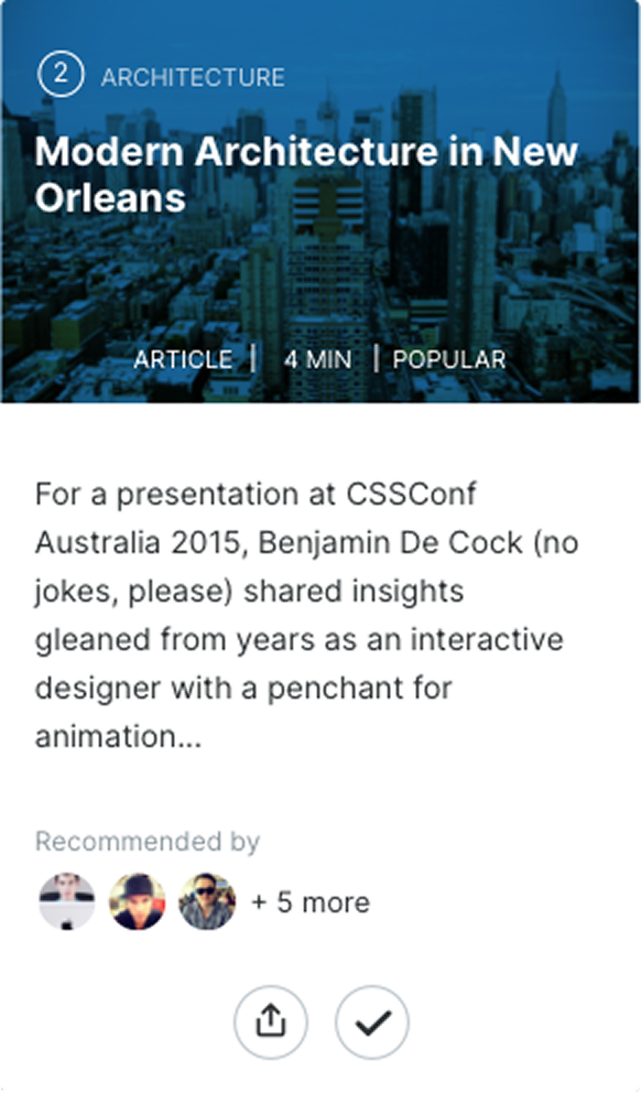
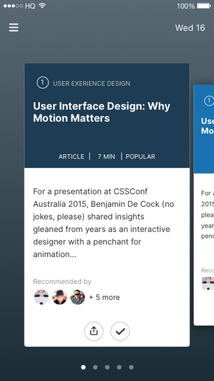
The first explorations leaned into interactive concepts, including swiping through cards in a carousel. It felt fun and game-like in early testing, but the novelty wore off and the engineering complexity made it difficult to scale.
Ultimately, this wasn’t the right long-term foundation.
Pivot to simplicity
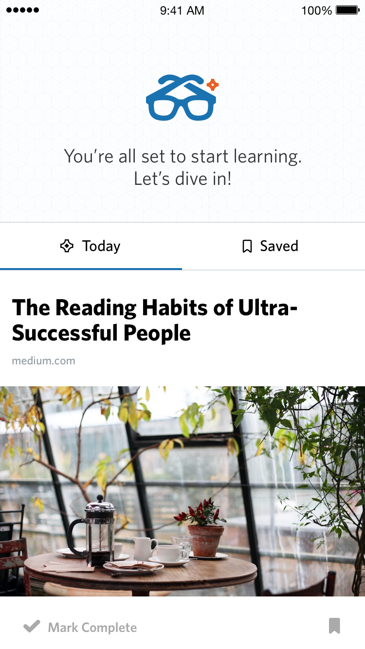
We stepped back and designed around a vertical feed — a familiar, scalable interaction that people already understood.
The MVP focused on a daily feed of five items, Save for Later, push notifications, and a basic profile. It gave learners just enough to make Degreed part of their daily routine.
The strongest interaction wasn’t novel. It was the one that made learning feel natural enough to repeat every day.
Meeting learners where they were
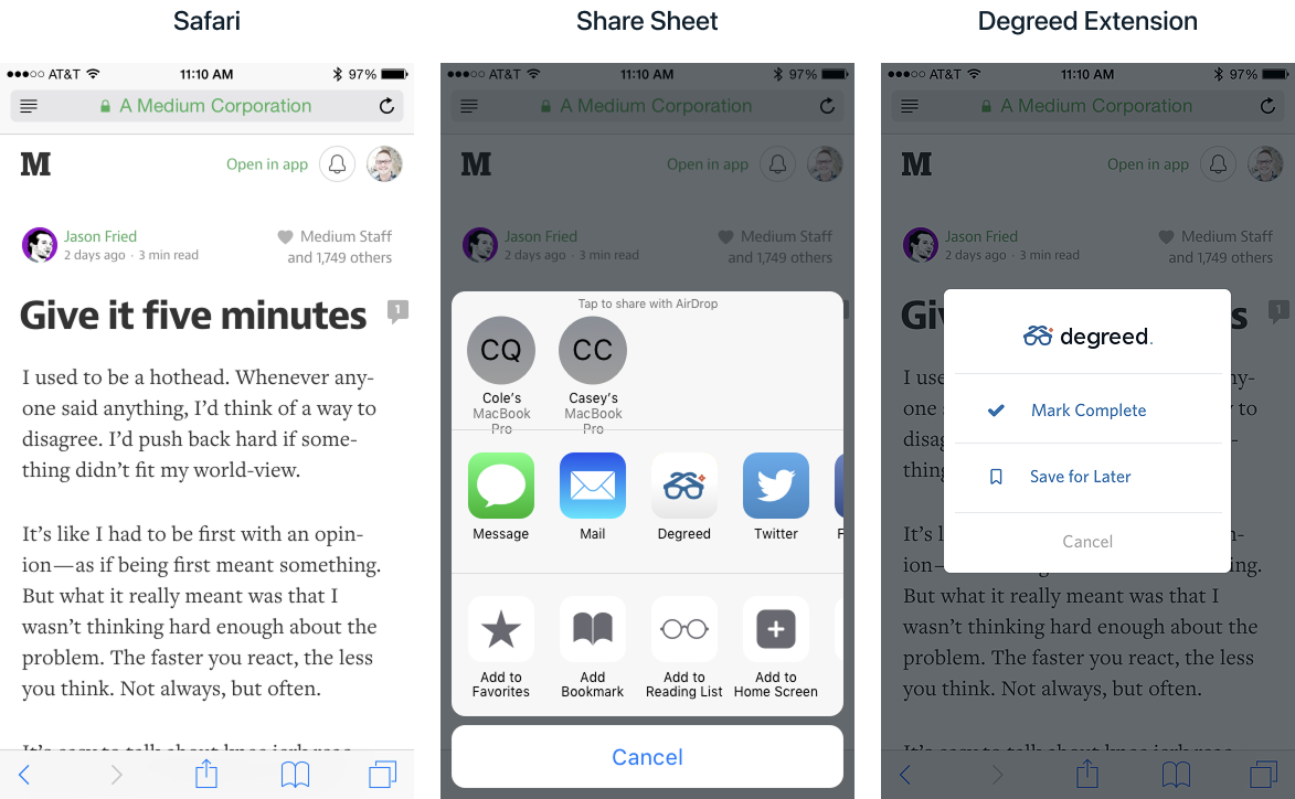
One of the most valuable additions was an iOS share extension. Learners could save content from Safari, YouTube, or podcasts directly into Degreed. That shifted the product from being a destination to becoming part of their daily flow.
Growth & expansion
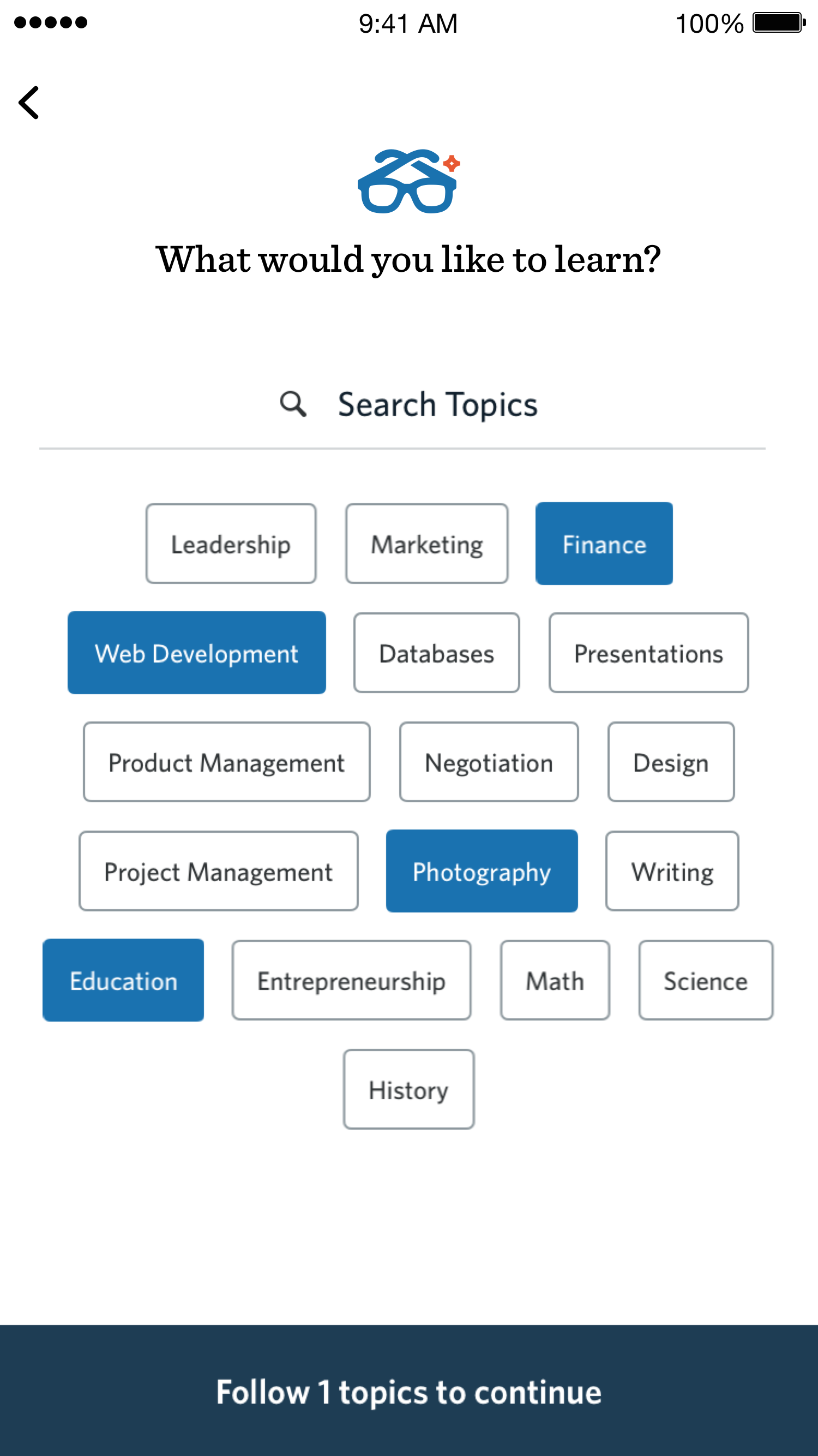
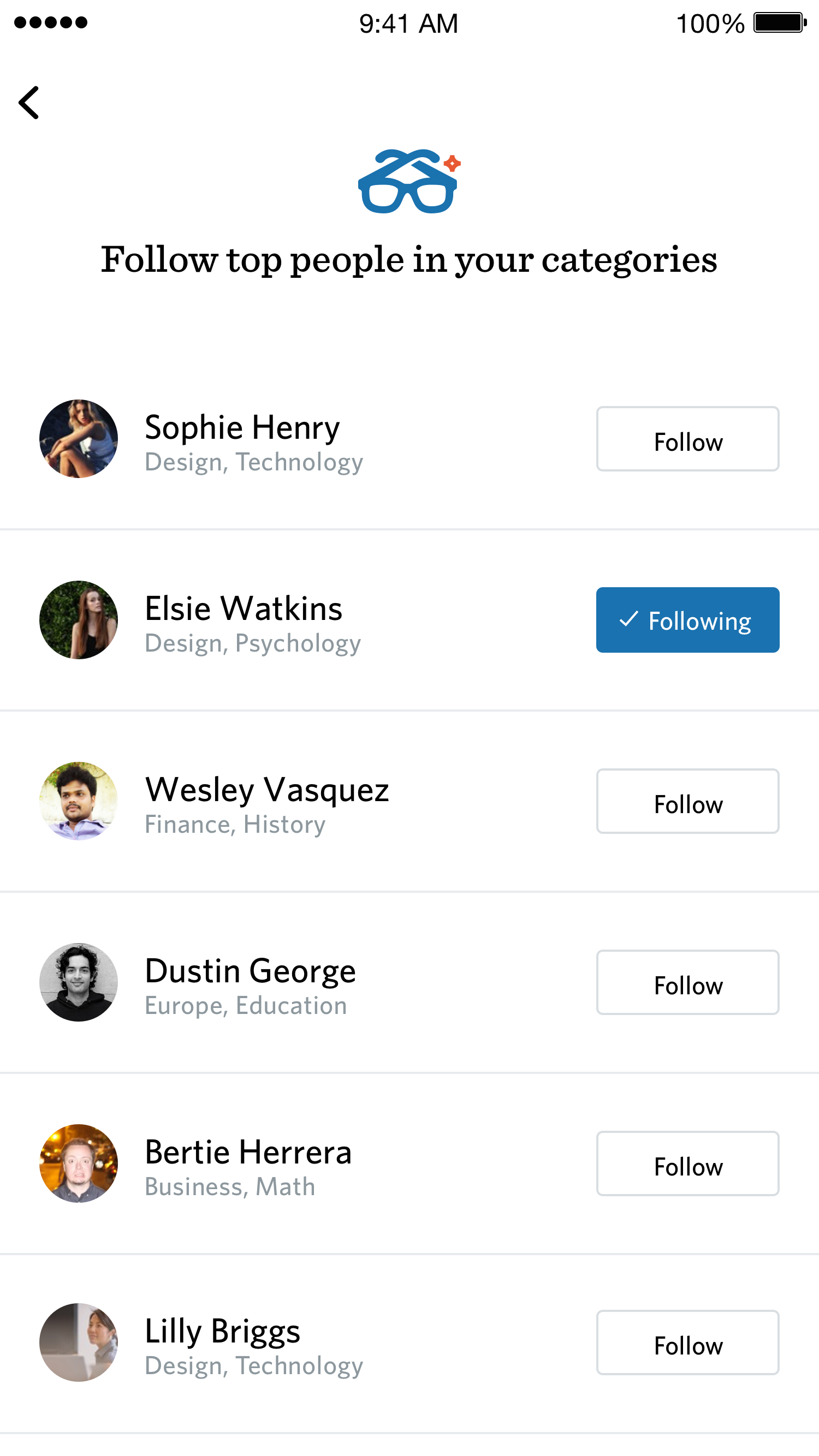
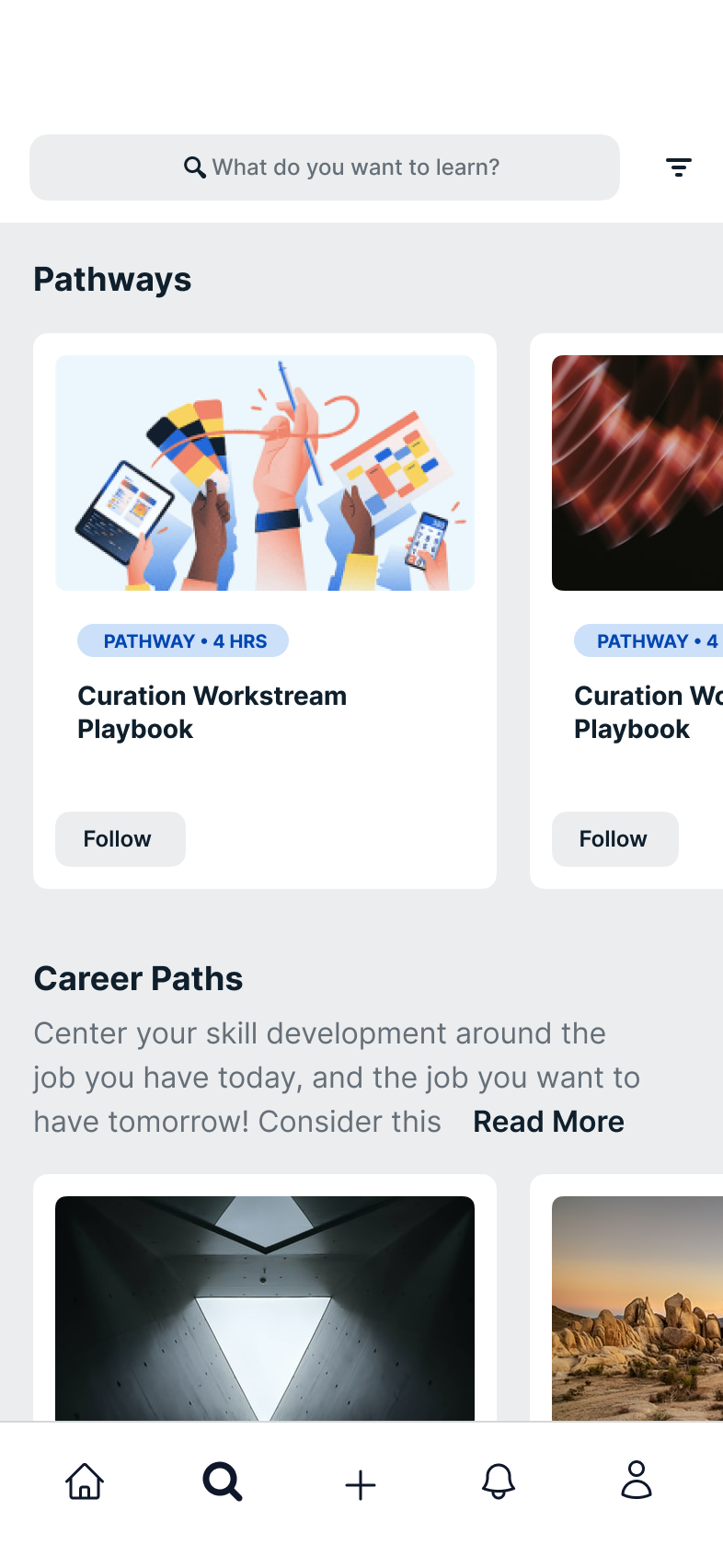
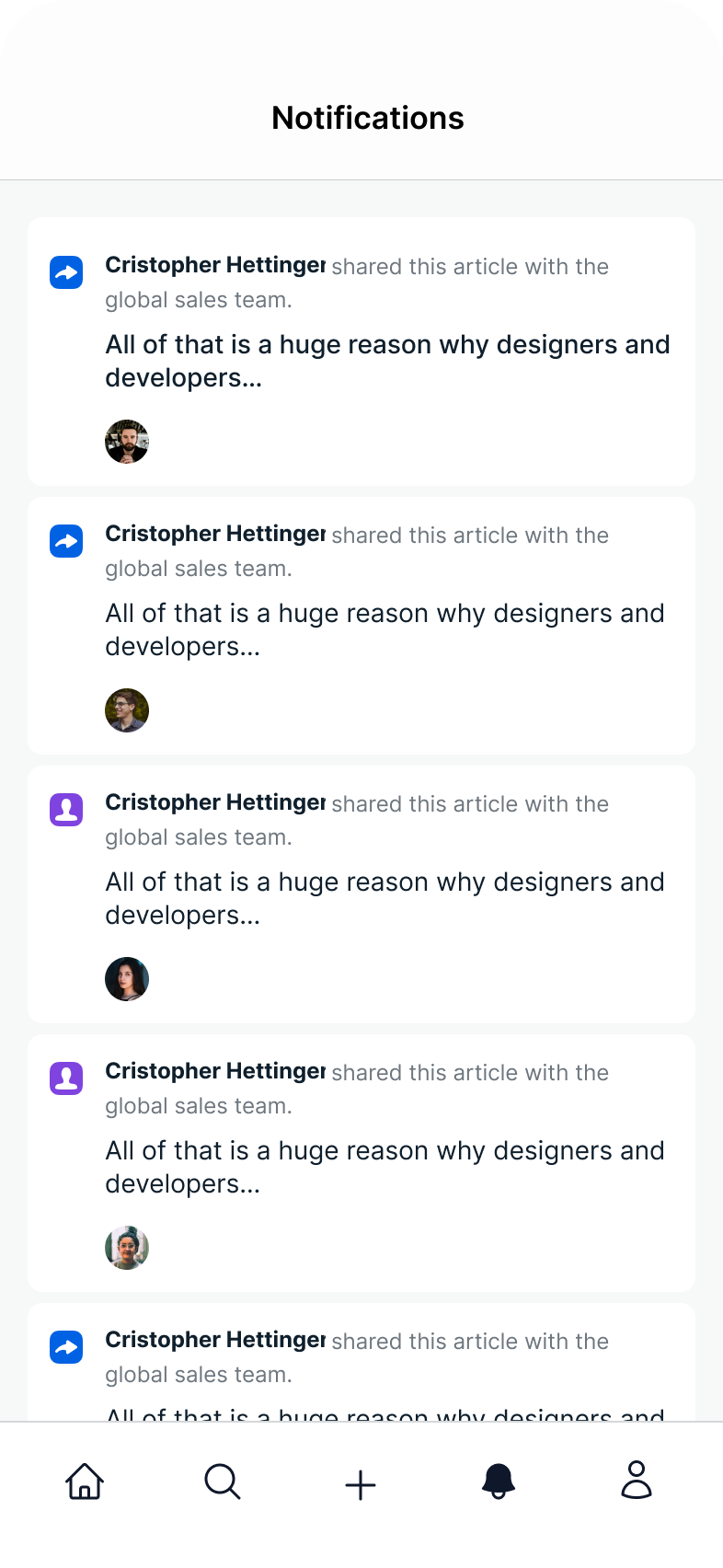
As adoption grew, customers wanted more functionality. We added features carefully while protecting the app’s lightweight nature: commenting with likes and replies, search and browsing, contextual notifications, and a profile of completed learning.
2019 refresh
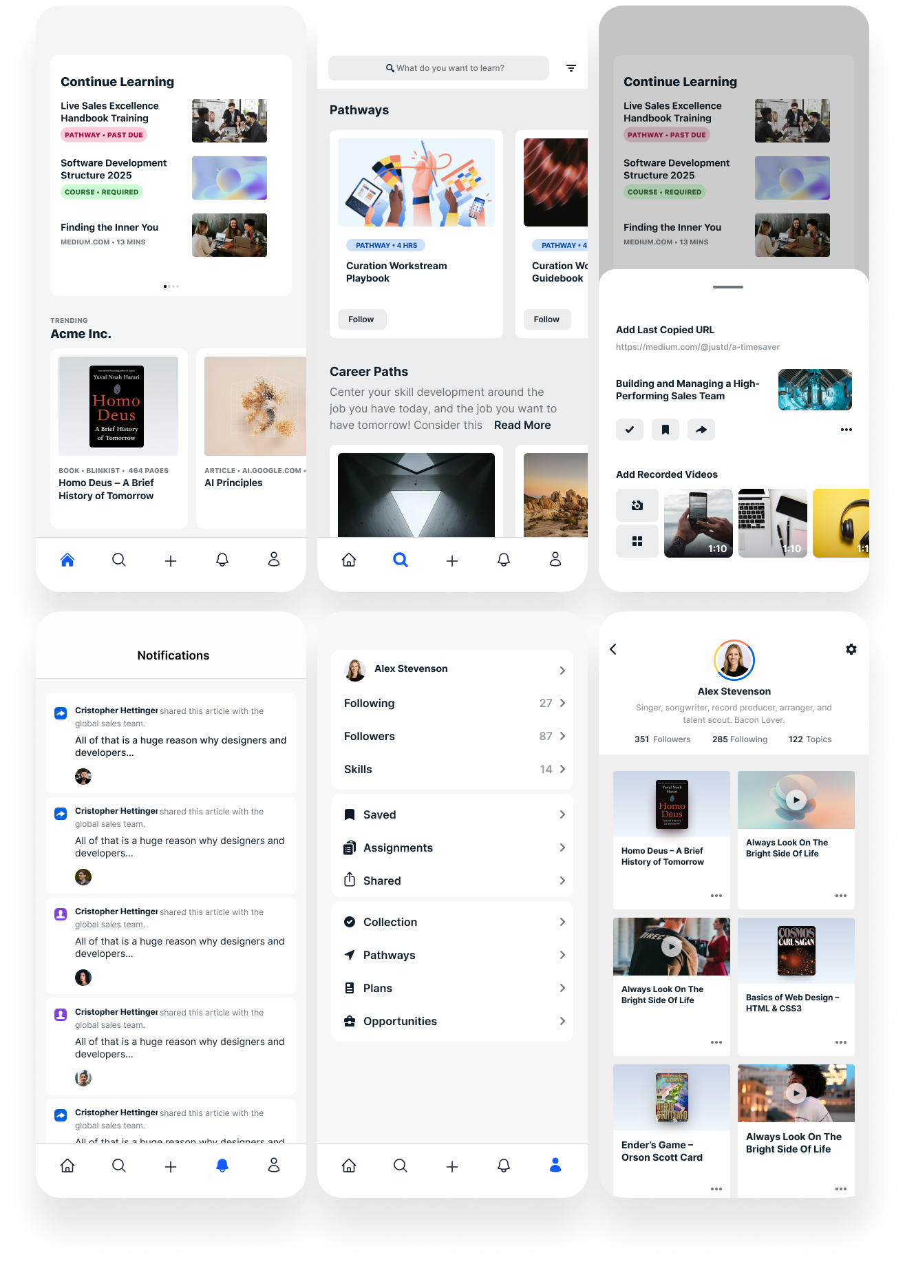
When Degreed refreshed its brand and redesigned Learner Home, mobile needed to evolve alongside it. We used the moment to modernize the UI and simplify the experience while keeping it approachable.
The refresh aligned mobile with web without losing the focused, lightweight quality that made the app useful.
 Casey Childs